
Let's be honest: the best content often gets ignored simply because it looks boring.
That's not your fault - it's how human brains are wired.
If you're trying to build an audience on LinkedIn (especially as a founder, agency owner, or consultant), formatting isn't a cherry on top. It's the difference between a post that gets 5 likes... and one that gets DMs, deals, and distribution.
1. The Isolation Effect (aka: make stuff pop)
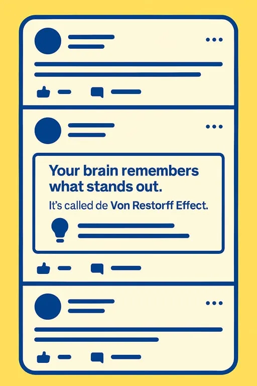
Your brain remembers what stands out.
It's called the Von Restorff Effect. When everything looks the same in a feed, a bold line, emoji, or short, snappy paragraph becomes magnetic.
Bold text draws the eye instantly
Italics signal a shift in tone or importance
Line breaks = breathing room
Want to see it in action? Scroll your LinkedIn feed right now and note what makes you stop scrolling. I bet it's not the wall of text.
Learn more about the isolation effect in content design
2. Cognitive Load (aka: don't make me work for it)
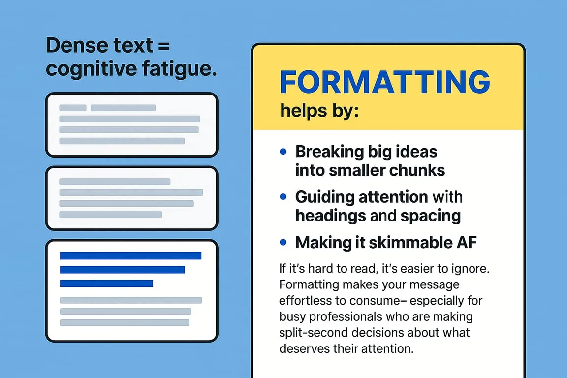
Dense text = cognitive fatigue.
No one opens LinkedIn hoping for a textbook.
Formatting helps by:
-
Breaking big ideas into smaller chunks
-
Guiding attention with headings and spacing
-
Making it skimmable AF
If it's hard to read, it's easier to ignore. Formatting makes your message effortless to consume-especially for busy professionals who are making split-second decisions about what deserves their attention.
Discover how smart formatting reduces cognitive load
3. Pattern Interruption (aka: scroll-stopping power)
Our brains get used to patterns fast. That's why endless paragraphs get glazed over.
When your post includes:
-
Short blocks of text
-
Unexpected formatting
-
Dialogue or contrast
…you disrupt the pattern.
And disruption equals attention.
Even something as simple as a numbered list in the middle of paragraphs can make people pause long enough to get hooked on your message.
Master pattern interruption to win attention
4. Framing Effect (aka: presentation is persuasion)
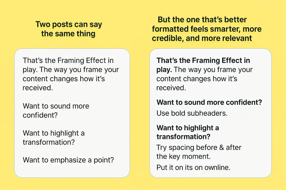
Two posts can say the same thing-but the one that's better formatted feels smarter, more credible, and more relevant.
That's the Framing Effect in play. The way you frame your content changes how it's received.
Want to sound more confident?
Use bold subheaders.
Want to highlight a transformation?
Try spacing before & after the key moment.
Want to emphasize a point?
Put it on its own line.
This psychological principle is why two identical messages can generate completely different results based solely on presentation.
How strategic framing drives influence
5. Aesthetic Usability (aka: pretty posts perform better)
People assume that if something looks good, it is good.
This isn't just a branding tip. It's backed by UX research: better-looking content gets more engagement regardless of substance.
Content that is:
| Formatting Element | Effect on Perception |
|---|---|
| Well-spaced | More thoughtful |
| Nicely structured | More professional |
| Visual contrast | More trustworthy |
Even when the actual words are identical.
Why aesthetically pleasing content consistently outperforms
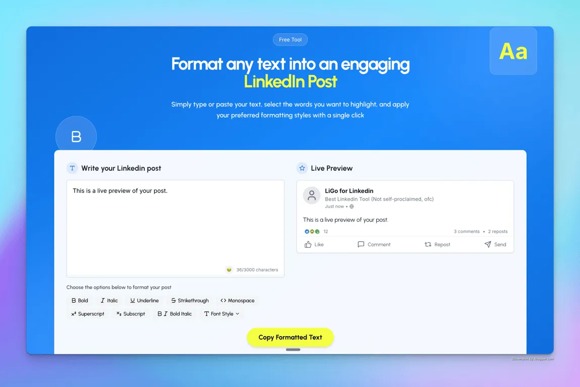
Pro Tip: You Don't Need to Format Manually
If you're using LiGo, formatting isn't something you have to remember. It's built in.
LiGo's editor does the heavy lifting:
-
Lets you bold/italicize inside the app
-
Applies your formatting preferences from previous posts
-
Learns your style and formats automatically (if you've given examples)
Even better: our LinkedIn analytics show exactly which formatting styles drive the most engagement for your specific audience.
Want to Test This?
Try formatting your next post using just these three elements:
-
Bold subheaders
-
Short 1-2 sentence paragraphs
-
A real CTA at the end (not just "thoughts?")
Watch what happens to your engagement metrics.
Or skip the formatting headache entirely and let LiGo handle it for you automatically.
Your message deserves to be seen. Good formatting is how you make sure it happens.
Tired of spending hours crafting LinkedIn posts that get ignored? Try LiGo free and see how proper formatting can transform your engagement.


